zlacker

[parent] [thread] 29 comments
1. madars+(OP)[view] [source] 2023-06-27 17:59:49
Don't forget making SMS in unreadable neon green (to the point that it violates Apple's own accessibility guidelines https://archive.is/4nSWV)

"iMessage on Android would simply serve to remove [an] obstacle to iPhone families giving their kids Android phones" -- an actual quote from the SVP of Software Engineering in charge of iOS, revealed in Epic Games v Apple court discovery

https://storage.courtlistener.com/recap/gov.uscourts.cand.36...

Of course, if you really cared about green bubbles, you'd switch to Android because there you can adjust outgoing message color to your heart's liking :-)

replies(4): >>lttlrc+a3 >>twobit+6m >>skygaz+hG >>jackso+hK
2. lttlrc+a3[view] [source] 2023-06-27 18:15:24
>>madars+(OP)
SMS messages have always been green on iOS. Since before iMessage existed. I don't recall ever having trouble reading them.
replies(3): >>madars+24 >>_rs+O8 >>trinsi+8l
◧◩
3. madars+24[view] [source] [discussion] 2023-06-27 18:19:49
>>lttlrc+a3
They deliberately reduced the contrast. Compare iOS 5 when iMessage came out: https://cdn.arstechnica.net/wp-content/uploads/archive/09-27... and now: https://images.macworld.co.uk/cmsdata/features/3468389/how_t... This underscores GP's point: Apple is expert at making anti-consumer decisions that fall just inside the Overton window.
replies(2): >>js2+Sc >>Profes+xf
◧◩
4. _rs+O8[view] [source] [discussion] 2023-06-27 18:41:03
>>lttlrc+a3
Not to mention it's only the messages you send that are with a green background, messages you receive from either platform have a grey background
◧◩◪
5. js2+Sc[view] [source] [discussion] 2023-06-27 19:01:13
>>madars+24
What am I missing here? In iOS 5, it's black on blue vs black on green. Now it's white on blue vs white on green. Contrast between text and background looks the same to whether green or blue.

In general, Apple has lowered contrast throughout the UI over the years. There's an accessibility setting for high contrast if you need it.

replies(2): >>AprilA+Mi >>cosmot+yj
◧◩◪
6. Profes+xf[view] [source] [discussion] 2023-06-27 19:15:46
>>madars+24
It's worth pointing out that Apple has some of the best accessibility options out there. There's an "Increase Contrast" setting that increases the contrast for SMS messages.

Yes, one could argue that the default should provide high contrast for everyone, but once this setting is enabled, it effectively becomes just that going forward for those that need it.

replies(1): >>mywitt+6n
◧◩◪◨
7. AprilA+Mi[view] [source] [discussion] 2023-06-27 19:35:25
>>js2+Sc
Green has higher luminance than blue at equivalent saturation. The values for SMS and iMessage background colors are, respectively and in sRGB, #00CC46 and #0080FF, corresponding to relative luminance values of 0.436 and 0.227 according to the WCAG 2 formula.

With white foreground text, this gives a contrast ratio of 2.15:1 for SMS and 3.79:1 for iMessage. WCAG 2.x AA level compliances requires a contrast ratio of at least 4.5:1 for normal text and at least 3:1 for large text.

https://www.w3.org/WAI/WCAG21/Understanding/contrast-minimum...

replies(2): >>madars+Fj >>js2+ZH
◧◩◪◨
8. cosmot+yj[view] [source] [discussion] 2023-06-27 19:40:06
>>js2+Sc
Contrast ratio for white on green is only 2.15:1 : https://webaim.org/resources/contrastchecker/?fcolor=FFFFFF&...

Whereas for black on green it's 9.72:1 : https://webaim.org/resources/contrastchecker/?fcolor=000000&...

◧◩◪◨⬒
9. madars+Fj[view] [source] [discussion] 2023-06-27 19:40:48
>>AprilA+Mi
Thanks! If you have a calculations workflow already, what would the contrast ratios (even if approximate) be for old iOS? To a human eye it truly looks like SMS got way worse whereas iMessage stayed around the same.
replies(1): >>AprilA+lr
◧◩
10. trinsi+8l[view] [source] [discussion] 2023-06-27 19:47:37
>>lttlrc+a3
I also Have no trouble reading text messages from Android in IOS. not sure what people are talking about. I still think its wrong to distinguish between the two platforms as it points to anti-competitive behavior. Apple does other things that are way worse.
11. twobit+6m[view] [source] 2023-06-27 19:52:59
>>madars+(OP)
The color thing is an urban legend. Original iPhone chat bubbles were green pre-Apple having an alternative to SMS. The messages icon is green. For some reason Apple thought messages should be green.
replies(1): >>BudaDu+1v
◧◩◪◨
12. mywitt+6n[view] [source] [discussion] 2023-06-27 19:57:19
>>Profes+xf
Apple products seem to require more and more tweaking of the right settings to be usable. I'm dreading the day I have to get a replacement MacBook and have to tweak all my settings again.
◧◩◪◨⬒⬓
13. AprilA+lr[view] [source] [discussion] 2023-06-27 20:21:38
>>madars+Fj
The pre-iOS 7 graphics have black text over a non-uniform background color as compared to white text over a uniform background color. This gives us ranges instead of a single value, but even in the worst case, black is a vastly more legible foreground color:

           | iOS 5-6     | iOS 7+ |
  ---------+-------------+--------+
  SMS      | 11.3 - 13.4 | 2.2    |
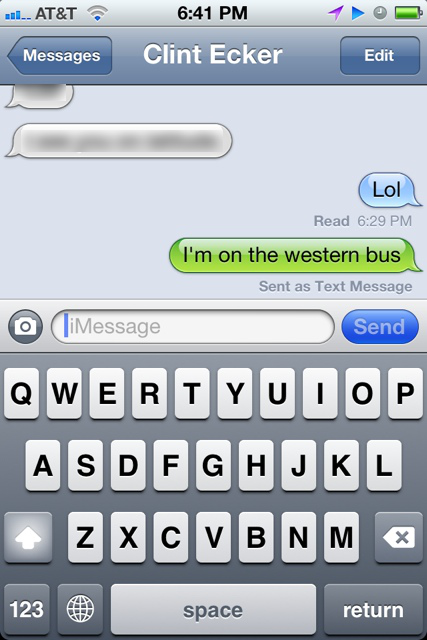
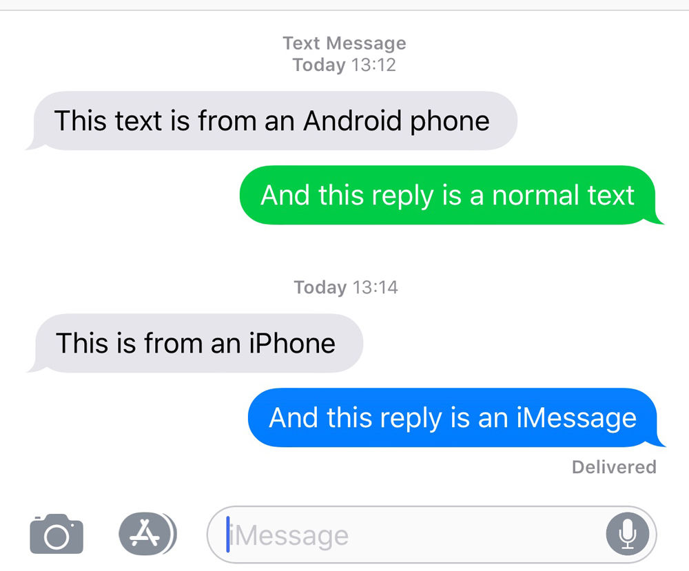
  iMessage | 11.8 - 14.1 | 3.8    |
◧◩
14. BudaDu+1v[view] [source] [discussion] 2023-06-27 20:42:29
>>twobit+6m
It's not that its green thats the issue, is the shade of green they chose. It does not contrast well with white text and makes it hard to read.
replies(2): >>rootus+5G >>andyfe+s91
◧◩◪
15. rootus+5G[view] [source] [discussion] 2023-06-27 21:40:50
>>BudaDu+1v
But the argument does become a lot weaker unless they changed the shade of green after introducing iMessage. If it stayed the same, then it's just the design they chose from the beginning.

Also worth noting is that the color only applies to sent messages. When you receive a message, it's just gray in either case. It makes a certain amount of sense to let the user know which transport their outbound message went on since it will affect your expectations.

replies(3): >>ryukaf+SJ >>goosed+6K >>lhamil+aQ
16. skygaz+hG[view] [source] 2023-06-27 21:42:12
>>madars+(OP)
For those not familiar, on an iPhone the green background only occurs on the messages the iPhone user has previously sent, and not those they have received from others. Also, whilst they’re typing, they do not have a green background in the text box. However, that said, to my eyes, the green background does indeed make it slightly harder to read what you’ve previously sent compared to the blue backgrounds of iMessage, or the black on light gray of received messages. But it’s slightly less of a problem to me because I generally remember what I’ve typed well enough to give my eyes an advantage.
◧◩◪◨⬒
17. js2+ZH[view] [source] [discussion] 2023-06-27 21:52:28
>>AprilA+Mi
Thank you. FWIW, here is it under iOS 16 with Accessibility > Display & Text Size > Increase Contrast turned on.

https://imgur.com/a/b61lmAf

To my eyes, the green/blue doesn't make much difference in terms of legibility. I obviously find the reduced contrast throughout iOS annoying and keep increase contrast turned on.

◧◩◪◨
18. ryukaf+SJ[view] [source] [discussion] 2023-06-27 22:02:30
>>rootus+5G
They did change the shade of green, and the newer one is much less readable. See for yourself:

Original: https://ronstauffer.com/blog/wp-content/uploads/taking-a-pic...

Current: https://support.apple.com/library/content/dam/edam/applecare...

replies(1): >>rootus+ZK
◧◩◪◨
19. goosed+6K[view] [source] [discussion] 2023-06-27 22:04:18
>>rootus+5G
They kinda did just not immediately. iMessage was introduced in iOS 5 pre-redesign. It used to be black text on a lighter green. With iOS 7 they moved to white text on searing green.
replies(1): >>rootus+gL
20. jackso+hK[view] [source] 2023-06-27 22:05:38
>>madars+(OP)
a much stronger argument than color imo is apple’s refusal to implement RCS, which would make the experience of communicating with android users.

generally I try to avoid SMS since the photo quality is bad, there’s no delivery guarantee, and it doesn’t work over wifi.

◧◩◪◨⬒
21. rootus+ZK[view] [source] [discussion] 2023-06-27 22:09:30
>>ryukaf+SJ
It may just be that I happen to have my reading glasses on right now, but both of those are easy to read.

But let's run with that for a moment, and assume many people do in fact find that more difficult to read. I still have trouble calling that particularly hostile given that it's sent messages, received ones are the same color no matter what.

I'm more open to the green vs blue argument than the old-green vs new-green one. Apple definitely wants you to know you're using iMessage. It just happens to be useful for me as a customer, too -- I'm glad it's prominent when I send a text message instead of an iMessage. It aligns my expectations for what features will work in the conversation.

replies(2): >>sterli+KS >>wizofa+MT
◧◩◪◨⬒
22. rootus+gL[view] [source] [discussion] 2023-06-27 22:11:24
>>goosed+6K
From my memories of that UI design shift, nobody cared much about text messages in particular, because we generally hated all of the flattened, vivid color and white text graphics. But it's been a while, maybe I'm misremembering how annoyed people were. That was when we lost skeuomorphic design, as I recall, which some people were/are very attracted to.
◧◩◪◨
23. lhamil+aQ[view] [source] [discussion] 2023-06-27 22:39:05
>>rootus+5G
They actually did change it. It used to be much more readable. There's a comparison screenshot in this article https://css-tricks.com/apple-messages-color-contrast/
◧◩◪◨⬒⬓
24. sterli+KS[view] [source] [discussion] 2023-06-27 22:55:17
>>rootus+ZK
I caution against relying on your own senses when designing for accessibility. I can tell the red and green buttons apart just fine, but I'm not colorblind. And even if I were, there's multiple kinds of colorblindness - and of vision disabilities in general, from dyslexia to astigmatism.

For small developers there's checker tools and simulators, but Apple is huge and has a responsibility to get this right.

replies(1): >>twobit+yX3
◧◩◪◨⬒⬓
25. wizofa+MT[view] [source] [discussion] 2023-06-27 23:01:20
>>rootus+ZK
> both of those are easy to read

Most accessibility problems aren't things that those without some sort of sensory disability (beyond mild long-sightedness) can detect easily - at least, without using tools to do so.

Surely though there is some sort of "accessible" mode you can put it into that does improve the contrast?

replies(1): >>j16sdi+H91
◧◩◪
26. andyfe+s91[view] [source] [discussion] 2023-06-28 00:54:41
>>BudaDu+1v
You know, I've always noticed that iMessages were blue and SMS were green, but I've never found one more or less legible than the other. To me the fact that they are different colours is nice.

I worry this a subjective matter, i.e. if the colours were reversed some people would make exactly the same complaint.

The actual argument really should focus on whether phone providers should use some interoperable standard more capable than SMS. If they can't come to consensus then the telecommunications regulators should involve themselves and force one.

replies(2): >>NoPick+9c1 >>solard+uH1
◧◩◪◨⬒⬓⬔
27. j16sdi+H91[view] [source] [discussion] 2023-06-28 00:56:26
>>wizofa+MT
The "increase contrast" option under accessibility settings with well for me.

In fact, it is much better than what iOS6 had.

◧◩◪◨
28. NoPick+9c1[view] [source] [discussion] 2023-06-28 01:14:28
>>andyfe+s91
Agree
◧◩◪◨
29. solard+uH1[view] [source] [discussion] 2023-06-28 06:19:39
>>andyfe+s91
That's what RCS is but Apple doesn't want to join. https://en.wikipedia.org/wiki/Rich_Communication_Services?wp...

iMessage is apparently a differentiator for them.

◧◩◪◨⬒⬓⬔
30. twobit+yX3[view] [source] [discussion] 2023-06-28 19:50:47
>>sterli+KS
I know a person that can only see red clearly, so he shifts colors in the iOS settings to a red tint. Green icons shifted to red work fine, but what doesn’t work are the health and music icons which are white on red. Applying the color shift in iOS just turns these into red squares. This stuff is hard to get right. For him it’s better to not have single color icons with no outlines, but that’s the trend today. You might think less detail in icons would help accessibility but that’s not always the case.
[go to top]