some things I've noticed: Mobil Safari seems to be using the search bar to hijack my google search (Particularly for locations which open in apple maps)
Although I'm mostly linux these days I went to install an alternative browser on a windows machine (using edge to download). I mentioned this in another post, but edge seems to watch for "chrome" or "firefox" downloads and politely reminds you that 'Edge is a great browser with added "trust of microsoft"' (A company who happen to be watching when you download a web browser).
https://www.theverge.com/2021/12/2/22813733/microsoft-window...
Linux seems like an OS that is way more respectful.
Battery throtteling on the iPhone 6s; The sandboxing / sideloading discussion; The no-iCloud experience; The way that regular bluetooth headsets work fine, but AirPods work even better; How unauthorized Apps on MacOS must be opened with a right-click.
Safari suggestions are also a great example: So far, I like them in iOS 17, since they can also provide direct links to useful sites such as Wikipedia. But don't doubt for a second, that taking traffic away from Google was the primary goal here.
Microsoft isn't so smart. Most users, including non-technical, can see through their attempts.
"iMessage on Android would simply serve to remove [an] obstacle to iPhone families giving their kids Android phones" -- an actual quote from the SVP of Software Engineering in charge of iOS, revealed in Epic Games v Apple court discovery
https://storage.courtlistener.com/recap/gov.uscourts.cand.36...
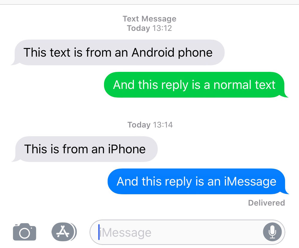
Of course, if you really cared about green bubbles, you'd switch to Android because there you can adjust outgoing message color to your heart's liking :-)
In general, Apple has lowered contrast throughout the UI over the years. There's an accessibility setting for high contrast if you need it.
With white foreground text, this gives a contrast ratio of 2.15:1 for SMS and 3.79:1 for iMessage. WCAG 2.x AA level compliances requires a contrast ratio of at least 4.5:1 for normal text and at least 3:1 for large text.
https://www.w3.org/WAI/WCAG21/Understanding/contrast-minimum...
To my eyes, the green/blue doesn't make much difference in terms of legibility. I obviously find the reduced contrast throughout iOS annoying and keep increase contrast turned on.