In general, Apple has lowered contrast throughout the UI over the years. There's an accessibility setting for high contrast if you need it.
Yes, one could argue that the default should provide high contrast for everyone, but once this setting is enabled, it effectively becomes just that going forward for those that need it.
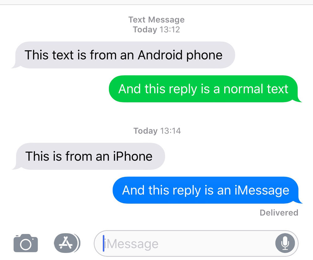
With white foreground text, this gives a contrast ratio of 2.15:1 for SMS and 3.79:1 for iMessage. WCAG 2.x AA level compliances requires a contrast ratio of at least 4.5:1 for normal text and at least 3:1 for large text.
https://www.w3.org/WAI/WCAG21/Understanding/contrast-minimum...
Whereas for black on green it's 9.72:1 : https://webaim.org/resources/contrastchecker/?fcolor=000000&...
           | iOS 5-6     | iOS 7+ |
  ---------+-------------+--------+
  SMS      | 11.3 - 13.4 | 2.2    |
iMessage | 11.8 - 14.1 | 3.8 |To my eyes, the green/blue doesn't make much difference in terms of legibility. I obviously find the reduced contrast throughout iOS annoying and keep increase contrast turned on.