zlacker

[parent] [thread] 5 comments
1. ryukaf+(OP)[view] [source] 2023-06-27 22:02:30
They did change the shade of green, and the newer one is much less readable. See for yourself:

Original: https://ronstauffer.com/blog/wp-content/uploads/taking-a-pic...

Current: https://support.apple.com/library/content/dam/edam/applecare...

replies(1): >>rootus+71
2. rootus+71[view] [source] 2023-06-27 22:09:30
>>ryukaf+(OP)
It may just be that I happen to have my reading glasses on right now, but both of those are easy to read.

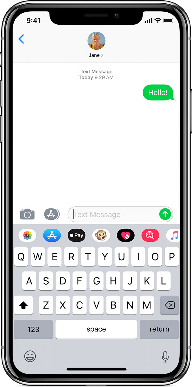
But let's run with that for a moment, and assume many people do in fact find that more difficult to read. I still have trouble calling that particularly hostile given that it's sent messages, received ones are the same color no matter what.

I'm more open to the green vs blue argument than the old-green vs new-green one. Apple definitely wants you to know you're using iMessage. It just happens to be useful for me as a customer, too -- I'm glad it's prominent when I send a text message instead of an iMessage. It aligns my expectations for what features will work in the conversation.

replies(2): >>sterli+S8 >>wizofa+U9
◧◩
3. sterli+S8[view] [source] [discussion] 2023-06-27 22:55:17
>>rootus+71
I caution against relying on your own senses when designing for accessibility. I can tell the red and green buttons apart just fine, but I'm not colorblind. And even if I were, there's multiple kinds of colorblindness - and of vision disabilities in general, from dyslexia to astigmatism.

For small developers there's checker tools and simulators, but Apple is huge and has a responsibility to get this right.

replies(1): >>twobit+Gd3
◧◩
4. wizofa+U9[view] [source] [discussion] 2023-06-27 23:01:20
>>rootus+71
> both of those are easy to read

Most accessibility problems aren't things that those without some sort of sensory disability (beyond mild long-sightedness) can detect easily - at least, without using tools to do so.

Surely though there is some sort of "accessible" mode you can put it into that does improve the contrast?

replies(1): >>j16sdi+Pp
◧◩◪
5. j16sdi+Pp[view] [source] [discussion] 2023-06-28 00:56:26
>>wizofa+U9
The "increase contrast" option under accessibility settings with well for me.

In fact, it is much better than what iOS6 had.

◧◩◪
6. twobit+Gd3[view] [source] [discussion] 2023-06-28 19:50:47
>>sterli+S8
I know a person that can only see red clearly, so he shifts colors in the iOS settings to a red tint. Green icons shifted to red work fine, but what doesn’t work are the health and music icons which are white on red. Applying the color shift in iOS just turns these into red squares. This stuff is hard to get right. For him it’s better to not have single color icons with no outlines, but that’s the trend today. You might think less detail in icons would help accessibility but that’s not always the case.
[go to top]