They are different fonts.
A lot of good looking mono fonts look very similar and there is a reason for that. As designers fine tune features for better legibility (main concern with terminal typeface) fonts converge to look roughly the same. But they still have different feel when you get a lot of text on a screen.
I love the little niceties of rendering arrows which are used all over the place these days.
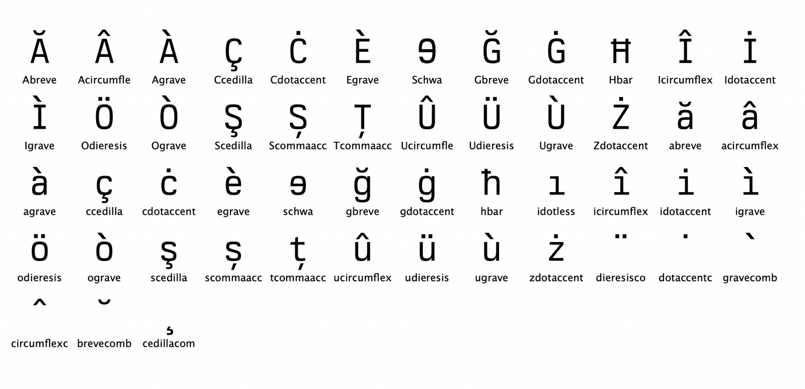
Current support:
  ISO 8859-1 Latin-1 Western European
  ISO 8859-2 Latin-2 Central European
  ISO 8859-3 Latin-3 South European
  ISO 8859-4 Latin-4 North European
  ISO 8859-9 Latin-5 Turkish
  ISO 8859-10 Latin-6 Nordic
  ISO 8859-13 Latin-7 Baltic Rim
  ISO 8859-15 Latin-9 Finnish, Estonian
ISO 8859-16 Latin-10 South-Eastern EuropeanI am always looking for a better font, and this one looks like it may be an improvement over my current one.
I like the limited width and left aligned text is also good, but IMHO the content as a whole should be in the center of the web page.
But to try it in my editor it seems I need to buy a $75 license first. Is there another free download button I missed?
I’m also a big fan of the design of the author’s website: https://neil.computer/
I was excited for it, but I cannot justify the price.
I may however consider the $25/year for commercial use if I ever want to use it.
It costs $75 for an individual license, not really in the spirit of UNIX
I'll plan for a nice page with various languages and full page screenshots.
Edit: Fixed link, thanks.
The owner of this website (neil.computer) does not allow hotlinking to that resource (/content/images/2022/02/Artboard-5.png).
One should be grateful to those who do release their hard work to the public domain or under a FOSS license, rather than being resentful toward those who don't.
People absolutely deserve to be compensated for their work, if they so choose, and they are absolutely permitted to release their work under any license they want.
I admire the marketing copy very much!
Font vendors seem to _love_ coming up with weird snowflake licensing schemes rather than trying to stick with something well understood.
This is would be the perfect application of it.
But I’m glad you asked. Learn about how font characters are structured[0]. Then zoom in, inspect and compare the details of a few characters from both fonts. This will help you understand how they’re different.
[0] https://www.fonts.com/content/learning/fontology/level-1/typ...
Eh, I think it’s a fair price, a. And b, pretty apt when you consider most Unixes were priced per core. BSD/OS itself was $1000 back in the day, according to my research, which was cheaper than System V, but obviously still expensive.
Linux was created for a reason.
And here I’ll refrain from making a snarky remark about how someone should make a similar font that is lower quality but will be way more popular.
Also the checkout flow on the website was super-slick. Nice job all round.
There are no page view limits for websites (no trackers), installation limits , epub/ebook limits, etc. Basically it is along the lines of FontSpring's worry free license and I think its even better.
I use PragmataPro and have done for many years. It's pretty similar to this but has lots of nice ligatures.
UNIX was created for ATT to sell more telephone service, and then later sold and licensed to other companies to likewise improve their internal computer usage. UNIX was not created to be zero cost. Apparently a commercial license for UNIX cost $20k at the time (or $150 for universities/educational institutions).
edit: IMHO $75 one time is a fair price for a premium font. Designers regularly pay $300 or more for typefaces they use in their work. There are monthly subscriptions to font foundries that cost more too.
And that's before you even bought the compiler license!
Maybe we could do a one time HN group buy @ $30 forever just this one time? Say a minimum of 25 people agree?
Don't get me wrong, it beautiful, easy to read and the price is right (in my opinion), but when you see the Python, even at 17pt, it seems squished. The characters just blurs together. This font either requires insane amounts of whitespace around it, or a high font size, I'm guessing no less than 20pt. Maybe it's just the line height that makes it weird, the characters seems like they need to be wider to avoid losing details.
You might look at the jetbrains individual license for some language that I think is more clear and objective: A personal license must be paid for by a single named individual, not paid or reimbursed by a company, and is not re-assignable, while the organizational license is more a "floating seat" that can be paid by a company and assigned to individual employees as needed. That helps sidestep the mess of trying to define what is "professional but not commercial."
Also, under a subscription model I'd want some assurance that previously created print materials receive a perpetual license even if I didn't renew and that I wouldn't have to try to excise it from everywhere I've used it in the past if the license ever lapsed.
Sure, you can organize you windows in a way to compensate and center the content manually. But I think there are two usage patterns:
1. maximized browser windows
2. non maximized windows
For the first pattern, the above statement is essential. Naturally, the user is looking at the center of the screen. The second pattern is somewhat unpredictable, because you neither know where the window is on the screen nor the size of it. But the typical behavior for centering content (`margin: 0 auto;`) does not make any difference compared to left aligned content when the window is smaller than the content. The only hard to judge situation is, when the window is not maximized, but larger than the content and I think for that case it is pretty hard to judge if left aligned or centered content is superior.
- the typeface is used in media, or otherwise distributed
- the typeface is used locally in some app
Which license supports which case?
Nor do I much care to use web fonts either, so while its very pretty, I dont know that its 75 dollars worth of pretty.
Edit: in the datasheet PDF, on page 14, I'm seeing both styles of 7 render the same. ss05 and ss06
Looks great, otherwise!
Where I made an explicit exception in the license is for developers using the typeface in IDEs, and using it in professional context. Also check input mono license which is where I got the inspiration from: https://input.djr.com/license/
Of course, I use it daily for writing code but I am biased :)
[1] neil@berkeleygraphics.com
From where did you get this idea? Citation needed.
As a follow up: If I work for SuperMegaCorp as a W-2 employee, I obviously qualify for a developer license, but as a 1099 contractor? And if I send a PDF invoice that uses this font - is that professional or commercial usage? Clearly, I am not a lawyer ;)
Very nice font, BTW.
I guess I could summarize as saying that an expensive[0] font just isn't, or more strongly, can't be interesting.[1]
[0]More than a cup of coffee, or so. [1]For personal use, marginal benefits scale differently on e.g. a billboard
https://github.com/cormullion/know-your-fonts/blob/master/as...
I think you need to go over the license copy with an attorney or native English speaker, since I am still left confused by your comments.
The problem is that it typically takes a week or so of use to determine if it would work for me. I'm not going to pay $75 for something that I won't know if I have any use for.
I doubt that this amount of work overlooked such a common programming font comparison. Any idea why they made them nearly identical?
Never seen that one with the negative-space slash. Is there a name for that?
The commercial license for this is also a steal.
Seems like on here, free typefaces are desired but a lot of these free typefaces are released by multi-million dollar corporations...they have someone on payroll to work on them.
I welcome indie typographers.
Edit: Fixed. Thank you!
https://berkeleygraphics.com/static/images/marketing/code-sy...
Is there an editor that can do things like this? Or is it all laid out by hand?
[1] https://neil.computer/notes/berkeley-mono-february-update/
There's no mention of this font having a manually hinted TTF version, which is pretty much required for rendering under these conditions. This gives me a very big pause. As others have said - at $75 a pop this font absolutely needs a downloadable, installable and usable trial. How it looks in PDF and rendered to a bitmap may showcase its design well, but not its real-world usage. That's assuming that the author means to position it also as a coding font (which seems to be the case judging by the samples).
I can't find an article for it, but I remember reading somewhere that AT&T's extravagant research budget and forays outside of telecommunications were partially a defensive maneuver: AT&T was aware that the US government could dismantle its monopoly at any moment, and invested heavily in R&D as a token of good faith.
Given the file name “Artboard-2” my guess is that it’s done in Adobe Illustrator, but you can do that in any graphics editing tool like Photoshop, Figma, Sketch, etc.
For typographic work, I recommend a vector-based tool because it scales to any resolution.
https://en.wikipedia.org/wiki/Crystal_Reports#/media/File:SA...
(if that is what you were asking)
It was only much later (and after significant arm twisting for more computing resources) that AT&T took UNIX seriously. Even then, the first marketed versions of UNIX were oriented towards programmers and technical editors, not telecommunication[2].
UNIX was created with no purpose in mind other than to get some MULTICS-like functionality out of an old machine and not worry about design-by-committee.
The first real use for it was document processing and it took off from there. Never was a telecom system ever at AT&T AFAIK and didn’t do networking until much later.
There were no “teams” there, just someone would see what someone else was working on and dive in to help. Stick a bunch of smart people in a building and see what comes out.
R&D at Bell Labs was to play with ideas first and then find an application. That’s how we got the transistor and UNIX, and waaaay more things that never saw the light of day.
That mode of R&D is dead now. It was dying even as UNIX was being developed, and they got management cover. The use for speeding up technical documentation really was the first business value justification. That was also how they managed to get the PDP-11 and how C got created for the port.
Bell Labs did a tremendous amount of basic research, materials science, and things with no direct commercial application.
At least personally, I find fonts are something that normalize very quickly. If I change the font on my text editor, I'd notice for a day or so but then it would cease to be 'a font' and go back to being 'words on screen'. I've only really noticed 'displeasure' at a working font[1] when I've got two machines and the settings wind up desynced so one doesn't look like 'how it's supposed to' according to my brain.
[0]e.g. if Hacker News changed its font I really might not notice.
[1]Exempting crap like Papyrus
I don't have a linux desktop handy, I'll create a full suite of screenshots in various environments and languages to post on the website.
Then... don't buy it? I mean, it's not like there aren't hundreds of other fonts to choose from, many of which are free.
At least with many open & free fonts, the SIL Open Font License is practically the standard.
[I am not affiliated with MonoLisa]
You could support Hungarian with only two additional letters.
I find the subscription license for commercial use a bit problematic. Say I have an app and I want to use the font. That’s “commercial” as long as it’s not “personal” AFAICT… and if I stop paying your fee some day then technically the app has to be modified or taken down.
This might not be a problem, but it’s not really “no strings attached.” There should be a fixed-fee perpetual commercial license as well.
Best of luck with it, I’m sure it’s hard to compete with all the free developer fonts!
Based on this screenshot, the readability suffers because the typographic color (edit for non-type-nerds… basically the density of ink in any block of text if printed in black)* is too dark. Single lines aren’t bad even if words could stand to be tracked out a touch, but the density makes entire blocks pretty tough to parse quickly, which is a showstopper for scanning logs. Outside of a terminal, you could mitigate it with leading and tracking to some extent. Even then, the combination of slightly heavy stroke weight, tall x-height, and comparatively tight packing make it feel pretty cramped.
Formally, the glyphs generally sit nicely as well-balanced individual artifacts, but the relationships don’t materialize to form visually fluid words. For example, if you look at “BERKELEY” in your title SVG, the slope on top of the B and R either needs to start later or needs to be more severe. With the strong horizontal created by the cap line in all the other letters, the very slight curve starting that early makes it seem uneven rather than softened. There isn’t enough horizontal momentum or obvious departure from it to look deliberate, and everything else is too uniform for that subtlety to look appropriate. Menlo, as probably the closest mono analog, resolves that tension by starting the curve later and making giving it a more deliberate attack.
I don’t think this has too far to go before being adapted, but those types of issues are what I’d expect to see in an open source type family rather than a $75 bundle. Having a flat price and throwing in a bunch of extra seats compared to the big foundries doesn’t really make sense. To business customers, $75 once vs some user based licensing billed out periodically doesn’t make much of a difference. Individual folks hesitate to pay $39 for Matthew Carter’s gorgeous Big Caslon because they don’t want to pay $39, not because they don’t get enough seats.
[1] https://neil.computer/content/images/size/w1600/2022/02/berk...
- I mainly test for clarity, how HD something is on my IDE from 12 to 16px. I paid for Monolisa (which I like a lot) but other open source fonts actually have higher fidelity(Luculent, Fairfax HD, Hermit, Agave) - this gives me pause on purchase of license. - No ligatures isn’t a deal breaker, but many open source fonts have them Day 1 & are implementing them well. My work place has lambdas & operators all over code base - some fonts make it easier to parse around. - Price is not bad overall, as I feel paid fonts are Quality of Life coder tools, like mechanical keyboards (pro surfers don’t use surfboards from Walmart). - Summary is that I’m on the verge to take the plunge but really need a day or 2 in the trenches with it to see how I flow with it. Trial version should exist like others say. Similarities to JetBrains Mono are there even if unintentionally so. - I support indie mono fonts, keep iterating!
There is also a complete Extended version but it has many issues, we won't be releasing that anytime soon.
.jpg)