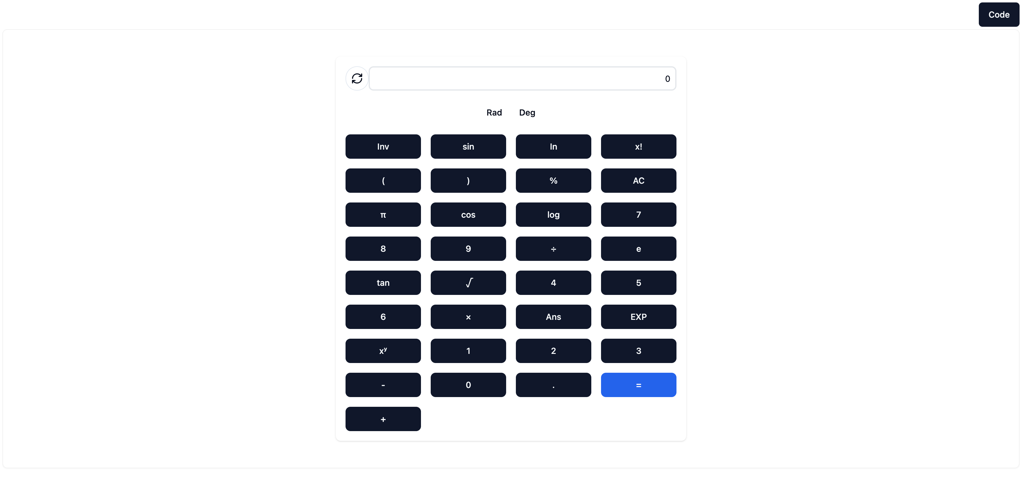
This screenshot of the generated calculator is rubbish https://pub-92e90cabe8b8410dbb5e46d17a83dce2.r2.dev/vx-websi.... This does not match the "high-quality, aesthetically pleasing UI" it boasts in the caption. What's with the ordering of all the buttons? Why is this the examble they chose to screenshot and advertise with?