https://www.ncei.noaa.gov/sites/default/files/2021-03/statio...
Notice how the data comes almost entirely from the USA and Australia. In Australia it's only the populated coastal regions with data, with the central deserts having none. Density in Europe is virtually non-existent by comparison, with Spain/Portugal having no data, most of Russia having no data, large parts of Europe having only a single station, there's nothing in China, India, Japan, there's a single station for the whole of Africa, etc. And of course the sea is missing.
By 1950 things have improved in the northern hemisphere somewhat:
https://www.ncei.noaa.gov/sites/default/files/2021-03/statio...
Russia and Europe now has coverage throughout, albeit with way lower station density than the USA (probably it doesn't matter much). The southern hemisphere outside of Australia is still almost completely missing, just a handful of stations outside of South Africa.
Even today most parts of the Earth's surface are missing direct land measurements (there are satellites):
https://climatedataguide.ucar.edu/sites/default/files/2022-0...
None of this is surprising. Only rich stable parts of the world can afford to spend time reliably reading thermometers every day. Europe spent a lot of the time before 1950 either at war or rebuilding.
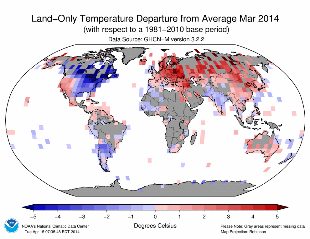
Note that missing data doesn't stop them colouring in those parts of the map with temperature readings and claiming they come from ground stations. They don't make it clear but for most of the world temperature readings are made up (interpolated over vast distances), example:
http://www.columbia.edu/~mhs119/Temperature/T_moreFigs/2015-...
They don't know what the mean was in 1950 for most of the world because they don't have any data, but that doesn't stop them drawing maps showing the change from that non-existent mean.